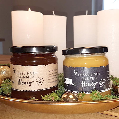
They sell honey since 2013 and used a basic template from the Swiss Bee Keeper Association for their honey tag. To change that, they asked me to design a new one.
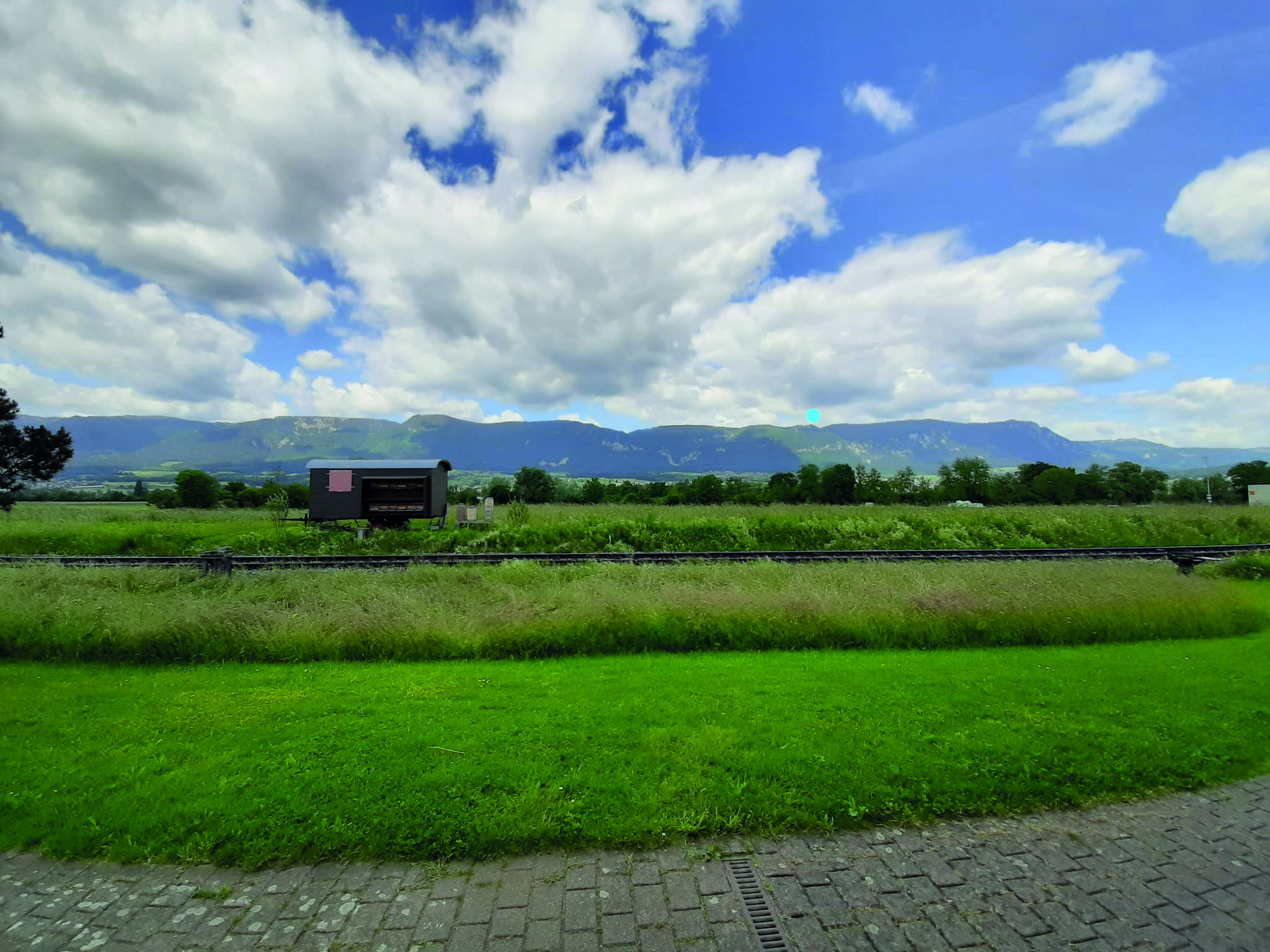
The blue bubble marks the position of the Weissenstein.


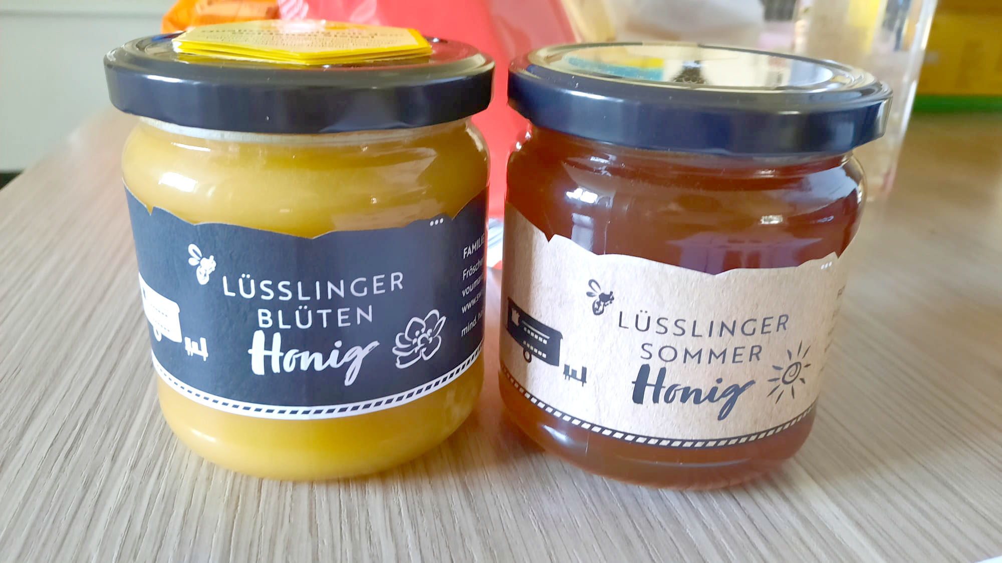
So here you see the finished honey tags. Since the summer honey is rather dark, I used the recycled paper background on this one and for the flowerhoney, which is much brighter, I used a slate background and reversed the font color.
With the selfmade icon right of the tag title, it gives a hint, what kind of honey it is, without reading the text. Well, that’s what it’s supposed to do at least.


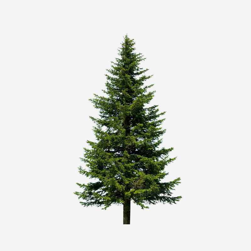
The fir is for the forest honey, but they didn’t make any of it yet.
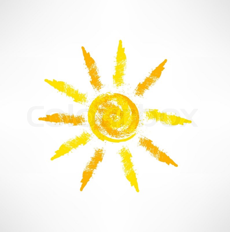
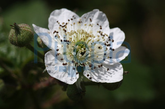



So with some E-Mails, we managed to create this beautiful tag, which immediately was recognized by the people, so they now have much more places, where they could sell their honey. Even in some places, there’s much cheapier honey, but people prefere the one from my sister, just because of the tag!
It was eye-opening when we saw the change, even for me and it’s such a motivating feeling, when people like, what you do or did!
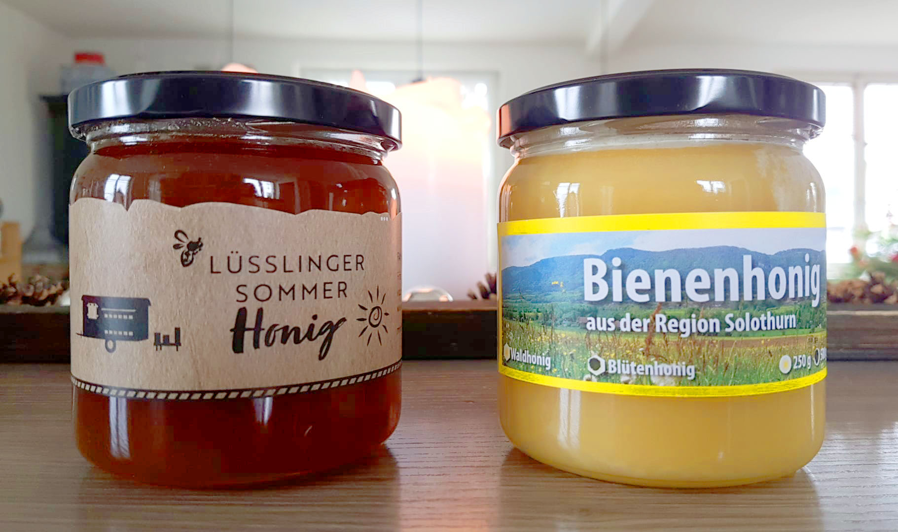
Here you can see the comparison of the basic honey tag from the Swiss Bee Keeper Association on the right and on the left side is my design.

